Home

Case Studies

Brand Strategy

Brand Strategist & Product Designer

My goal, to modernize the identity while preserving its neighborhood charm.

Overview

The Last Carrot is a Coconut Grove staple, loved for its healthy sandwiches, juices, and vegetarian-friendly menu. Despite its loyal following, the brand felt dated and inconsistent, lacking the freshness and quality of its food.

My goal: modernize the look and feel while staying true to its roots.
The Challenge

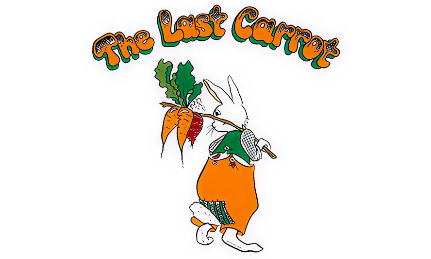
The brand felt dated and inconsistent. As the neighborhood grew, The Last Carrot risked being overshadowed by newer competitors, like Sweetgreen and Pura Vida.
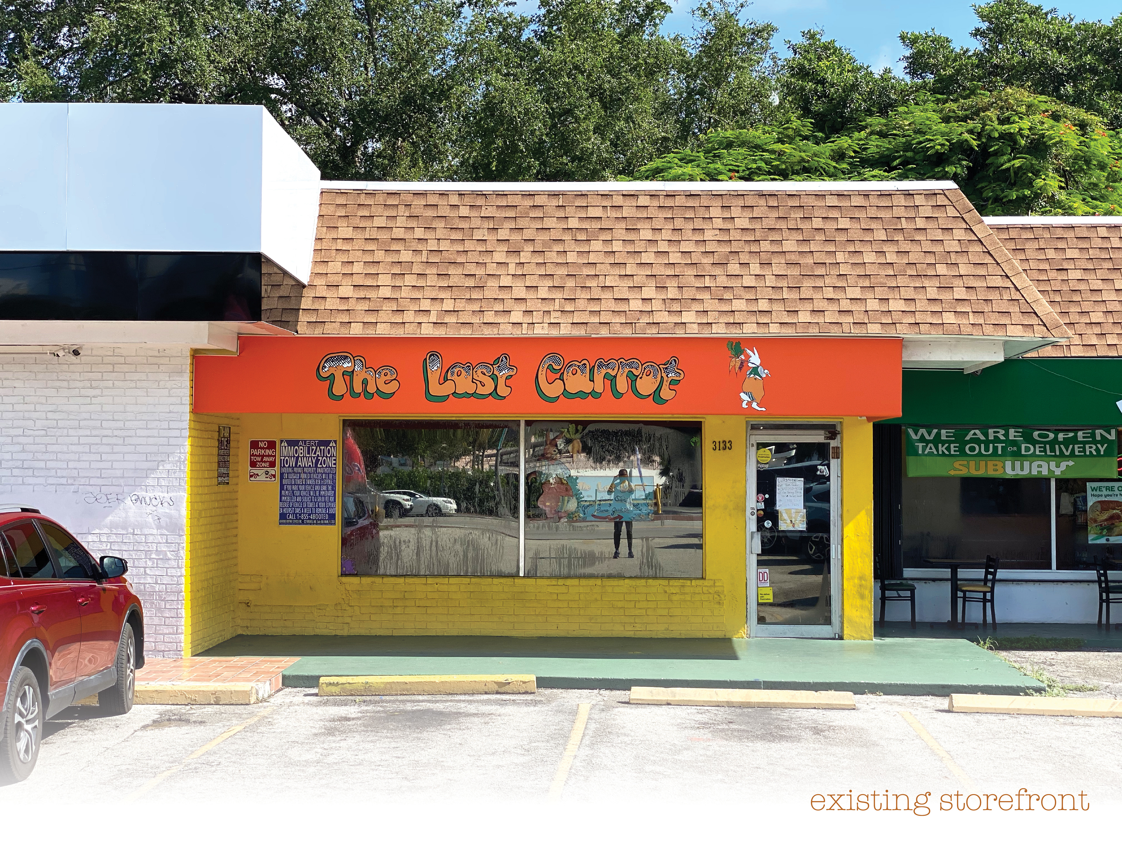
“The Grove’s changing so fast, we want to keep up but also stay true to ourselves.”

-Location Owner

My Role

Oversaw the complete brand refresh from strategy to execution.

  • Led brand strategy and visual redesign
  • Defined design principles: fresh, approachable, consistent
  • Built a scalable system for menus, signage, and digital touchpoints

The Approach

I focused on creating a modern, authentic identity rooted in the brand’s values.

Key themes:

Fresh | Authentic | Rooted | Local

  • Researched customer perceptions and local competition
  • Explored directions through sketches, palettes, and type studies
  • Refined into a system blending heritage with modern simplicity

The Solution

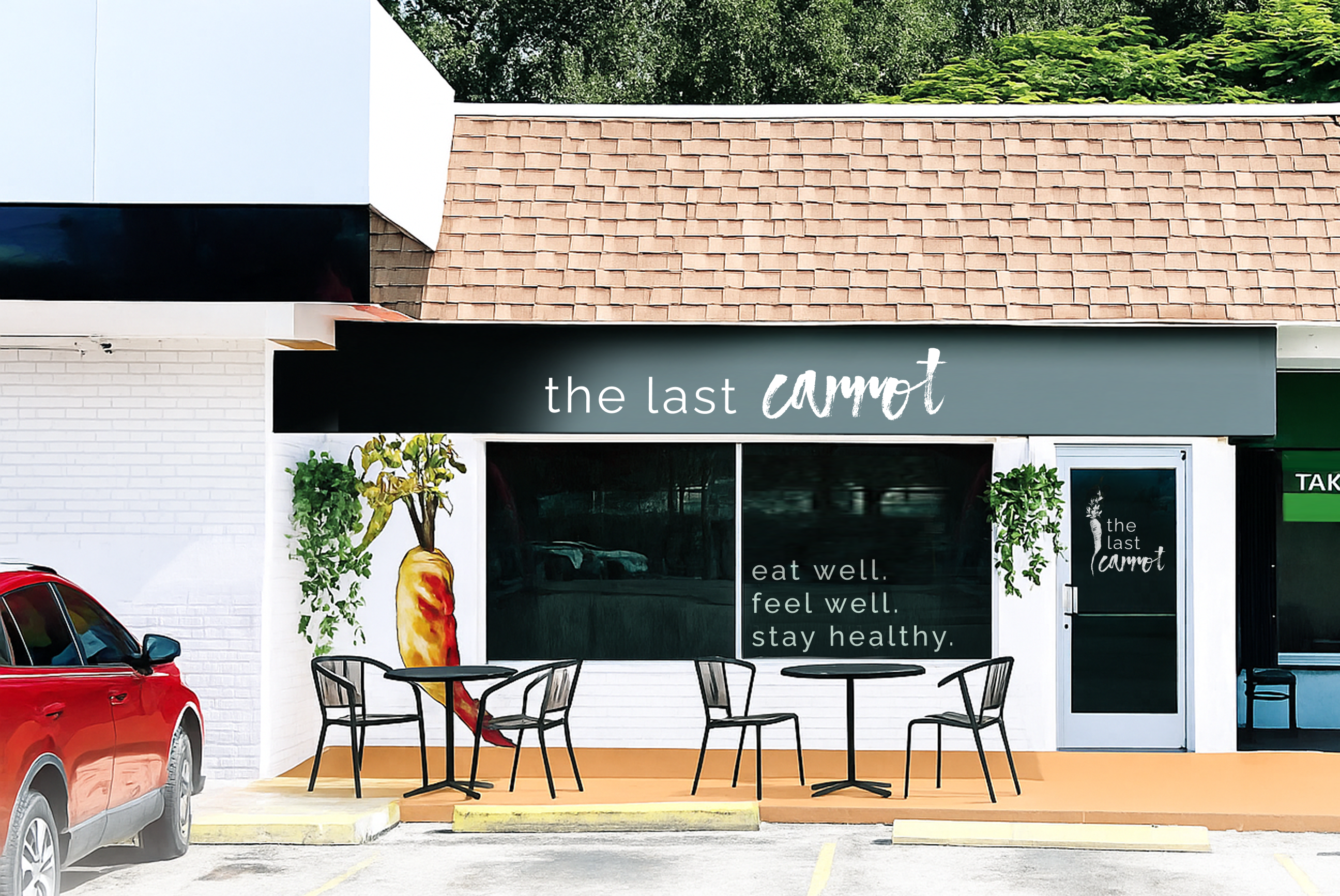
So… I reimagined The Last Carrot’s brand to feel as fresh and authentic as the food itself—bringing consistency, clarity, and charm to every touchpoint. See image below of proposed exterior redesign.

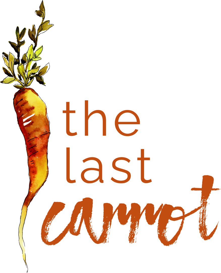
  • A fresh logo pairing Atmosphere Script with Raleway for balance
  • Warm, produce-inspired color palette rooted in nature
  • Flexible typography system (Medium for body, Bold for emphasis)
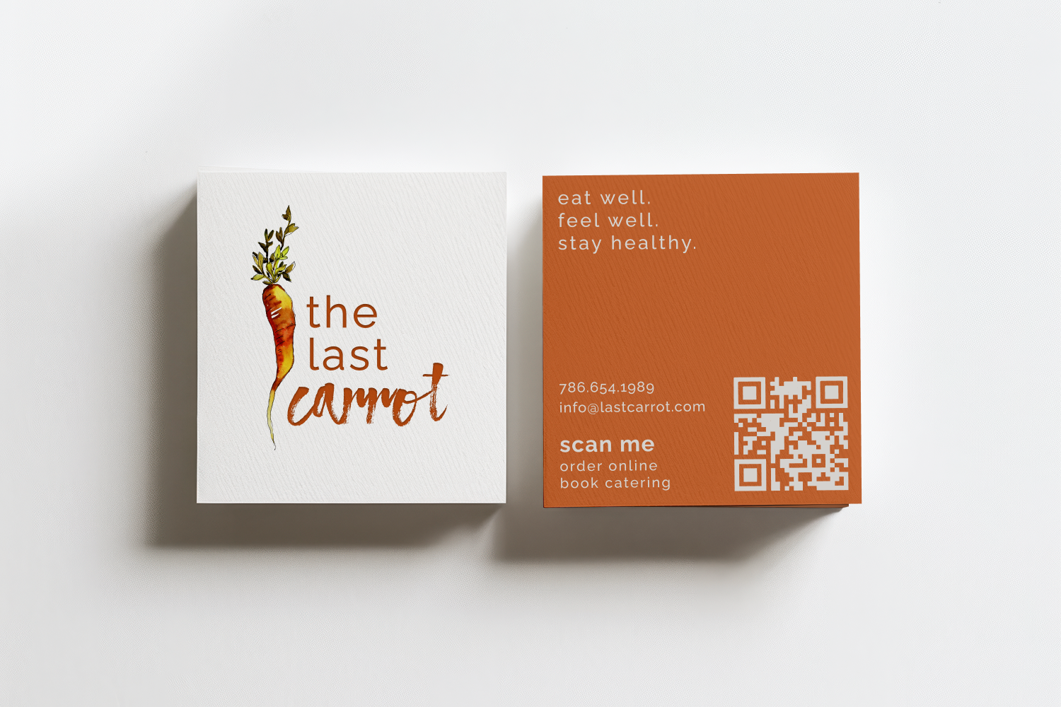
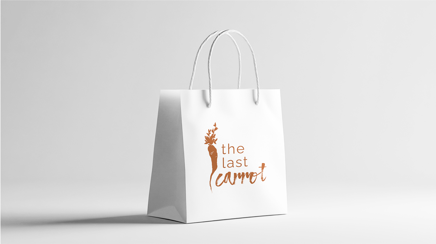
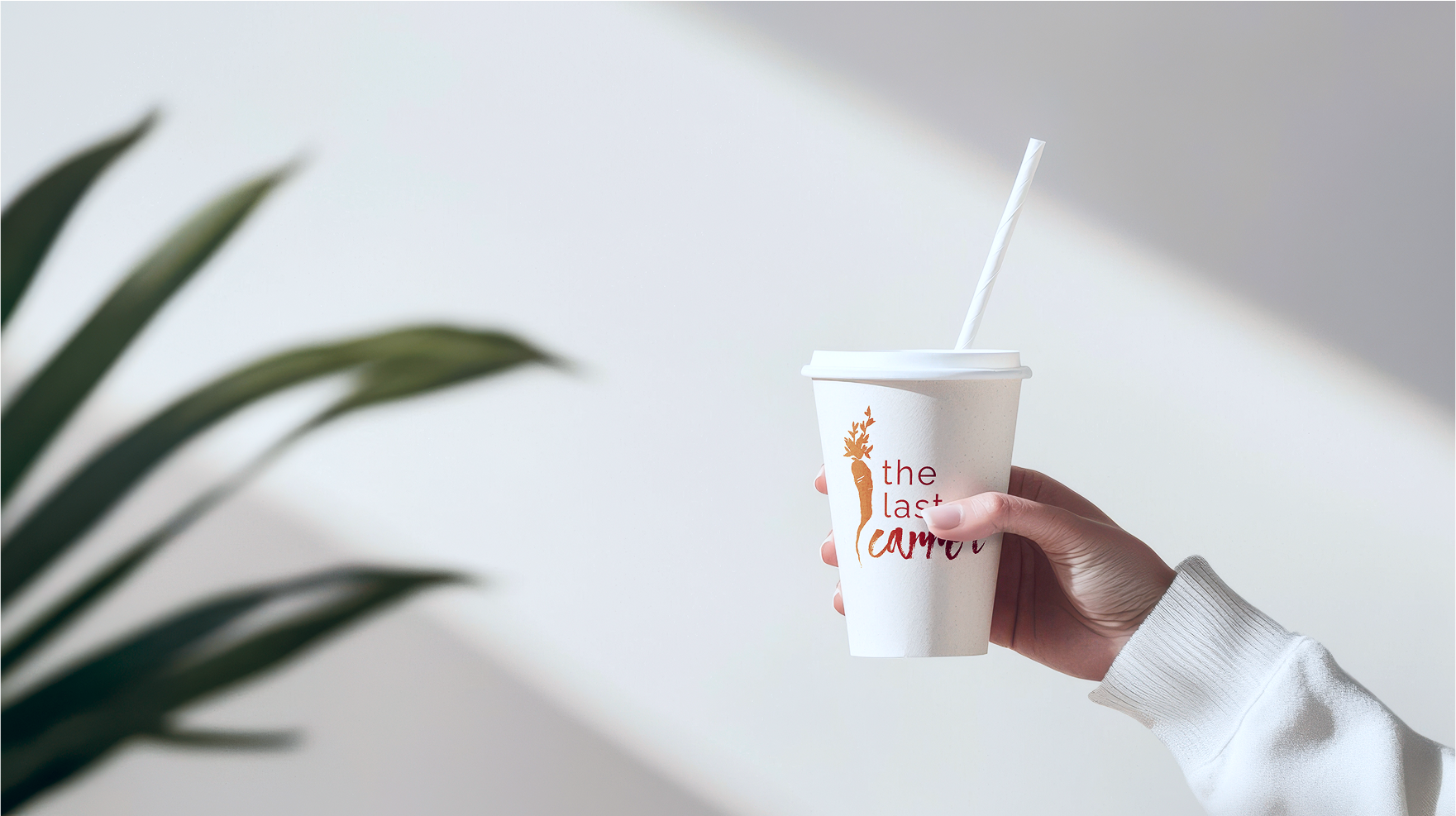
  • Scalable applications: storefront, menus, packaging, business cards

The Impact

The rebrand created a unified identity that strengthened recognition, and positioned The Last Carrot for long-term relevance. Menus became easier to navigate, and the updated identity positioned The Last Carrot to attract both loyal locals and new customers exploring the Grove.

  • Unified the brand across all customer touchpoints
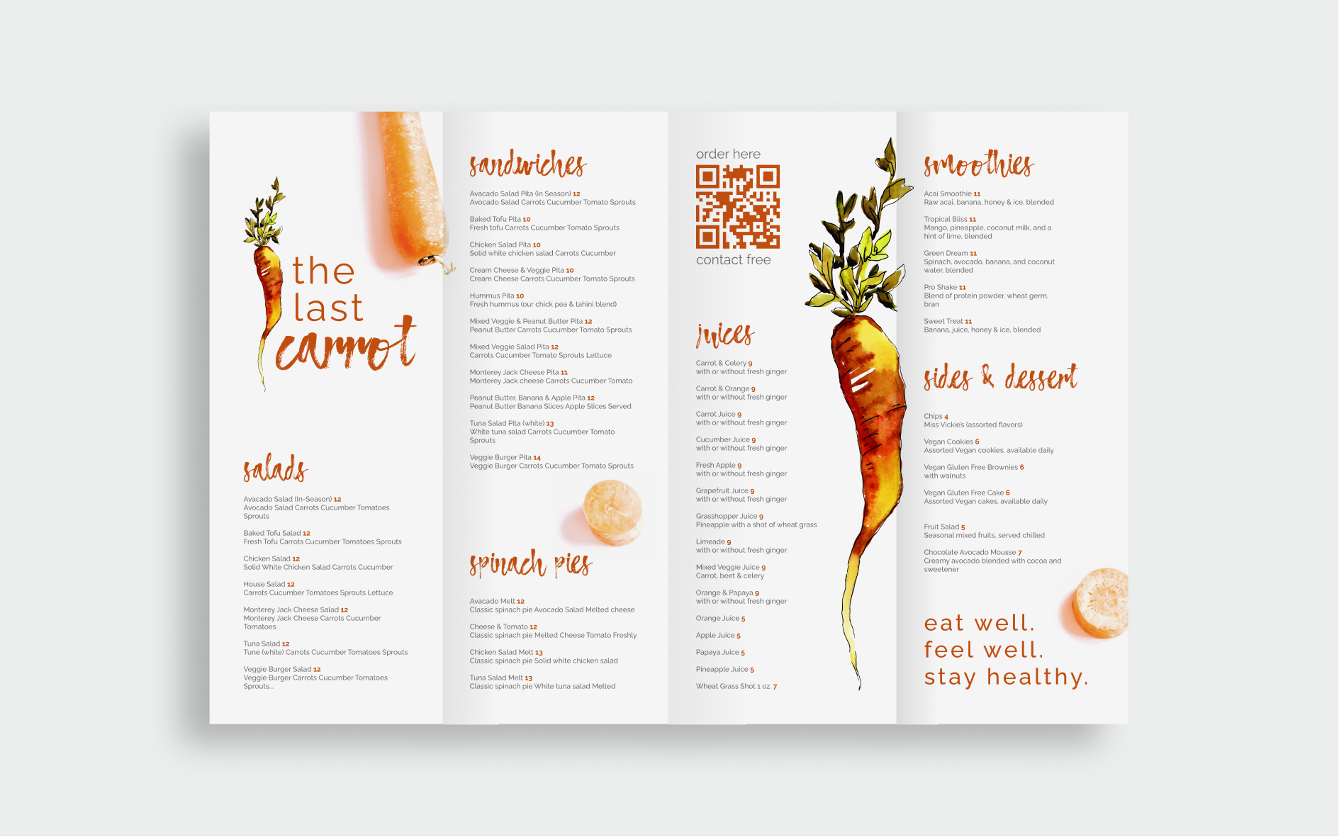
  • Increased legibility and consistency in menus
  • Positioned the brand to stand out in a rapidly evolving neighborhood

“The new look gives us confidence. It finally matches the quality of what we serve every day.”

-Location Owner

Branding & Marketing

I developed a brand system that feels clean, modern, and trustworthy, focused on clarity over flash. The identity is designed to be flexible across app, web, and pitch materials, while keeping the experience approachable and community-first.

Color

The Last Carrot’s color palette is rooted in nature, designed to reflect the warmth, freshness, and organic quality of its menu.


Drawn from produce itself, earthy oranges, leafy greens, and golden yellows, the colors feel vibrant yet natural. They create an inviting atmosphere that mirrors the experience of walking into the shop or unwrapping a freshly made sandwich.


Rather than feeling trendy or over-designed, the palette is timeless, ensuring the brand stays relevant as the neighborhood evolves while staying true to its roots.

Primary Palette

Off-Black

Hex: #212121

Red Orange

Hex: #C04E0F

Yellow

Hex: #EAB411

Grey

Hex: #6F6F6F

Light-Grey

Hex: #F1F1F1

White

Hex: #FFFFFF

Typography

I chose a combination of Atmosphere Script and Raleway to create a distinct voice for The Last Carrot. One that feels fresh, local, and timeless while guiding the eye through each piece of communication with clarity.

Headings

Atmosphere

A textured, brush-style script that captures the natural, artisanal quality of The Last Carrot’s food. Its hand-painted feel adds authenticity and character, making the logo instantly recognizable and rooted in the brand’s fresh, made-by-hand ethos.

Primary Typeface

Raleway Medium

Used for most body text and key labels, Raleway Medium is clear, versatile, and highly readable in both digital and print formats. It creates a cohesive visual rhythm when paired with the logo.

Secondary Typeface

Raleway Bold

Applied sparingly to highlight important information, such as menu prices or callouts. Raleway Bold draws attention without overpowering the design, ensuring emphasis where it matters most.

Home

Case Studies

Brand Strategy

Brand Strategist & Product Designer

My goal, to modernize the identity while preserving its neighborhood charm.

Overview

The Last Carrot is a Coconut Grove staple, loved for its healthy sandwiches, juices, and vegetarian-friendly menu. Despite its loyal following, the brand felt dated and inconsistent, lacking the freshness and quality of its food.

My goal: modernize the look and feel while staying true to its roots.

The Challenge

The brand felt dated and inconsistent. As the neighborhood grew, The Last Carrot risked being overshadowed by newer competitors, like Sweetgreen and Pura Vida.

“The Grove’s changing so fast, we want to keep up but also stay true to ourselves.”

-Location Owner

My Role

Oversaw the complete brand refresh from strategy to execution.

  • Led brand strategy and visual redesign
  • Defined design principles: fresh, approachable, consistent
  • Built a scalable system for menus, signage, and digital touchpoints

The Approach

I focused on creating a modern, authentic identity rooted in the brand’s values.

Key themes: Fresh | Authentic | Rooted | Local

  • Researched customer perceptions and local competition
  • Explored directions through sketches, palettes, and type studies
  • Refined into a system blending heritage with modern simplicity

The Solution

So… I reimagined The Last Carrot’s brand to feel as fresh and authentic as the food itself—bringing consistency, clarity, and charm to every touchpoint. See image below of proposed exterior redesign.

  • A fresh logo pairing Atmosphere Script with Raleway for balance
  • Warm, produce-inspired color palette rooted in nature
  • Flexible typography system (Medium for body, Bold for emphasis)
  • Scalable applications: storefront, menus, packaging, business cards
The Impact

The rebrand created a unified identity that strengthened recognition, and positioned The Last Carrot for long-term relevance. Menus became easier to navigate, and the updated identity positioned The Last Carrot to attract both loyal locals and new customers exploring the Grove.

  • Unified the brand across all customer touchpoints
  • Increased legibility and consistency in menus
  • Positioned the brand to stand out in a rapidly evolving neighborhood
“The new look gives us confidence. It finally matches the quality of what we serve every day.”

-Location Owner

Branding & Marketing

I created a brand system that wove The Last Carrot’s personality, heritage, and values into every detail—bringing the same warmth you feel when you walk up to the storefront into the menus, packaging, and signage. Every touchpoint was designed to feel fresh, familiar, and unmistakably theirs.

Color

The Last Carrot’s color palette is rooted in nature, designed to reflect the warmth, freshness, and organic quality of its menu.


Drawn from produce itself, earthy oranges, leafy greens, and golden yellows, the colors feel vibrant yet natural. They create an inviting atmosphere that mirrors the experience of walking into the shop or unwrapping a freshly made sandwich.


Rather than feeling trendy or over-designed, the palette is timeless, ensuring the brand stays relevant as the neighborhood evolves while staying true to its roots.

Primary Palette

Off-Black

Hex: #212121

Red Orange

Hex: #C04E0F

Yellow

Hex: #EAB411

Grey

Hex: #6F6F6F

Light-Grey

Hex: #F1F1F1

White

Hex: #FFFFFF

Typography

I chose a combination of Atmosphere Script and Raleway to create a distinct voice for The Last Carrot. One that feels fresh, local, and timeless while guiding the eye through each piece of communication with clarity.

Headings

Atmosphere

A textured, brush-style script that captures the natural, artisanal quality of The Last Carrot’s food. Its hand-painted feel adds authenticity and character, making the logo instantly recognizable and rooted in the brand’s fresh, made-by-hand ethos.

Primary Typeface

Raleway Medium

Used for most body text and key labels, Raleway Medium is clear, versatile, and highly readable in both digital and print formats. It creates a cohesive visual rhythm when paired with the logo.

Secondary Typeface

Raleway Bold

Applied sparingly to highlight important information, such as menu prices or callouts. Raleway Bold draws attention without overpowering the design, ensuring emphasis where it matters most.

Home

Case Studies

Brand Strategy

Brand Strategist & Product Designer

My goal, to modernize the identity while preserving its neighborhood charm.

Overview

The Last Carrot is a Coconut Grove staple, loved for its healthy sandwiches, juices, and vegetarian-friendly menu. Despite its loyal following, the brand felt dated and inconsistent, lacking the freshness and quality of its food.

My goal: modernize the look and feel while staying true to its roots.

The Challenge

The brand felt dated and inconsistent. As the neighborhood grew, The Last Carrot risked being overshadowed by newer competitors, like Sweetgreen and Pura Vida.

“The Grove’s changing so fast, we want to keep up but also stay true to ourselves.”

-Location Owner

My Role

Oversaw the complete brand refresh from strategy to execution.

  • Led brand strategy and visual redesign
  • Defined design principles: fresh, approachable, consistent
  • Built a scalable system for menus, signage, and digital touchpoints

The Approach

I focused on creating a modern, authentic identity rooted in the brand’s values.

Key themes: Fresh | Authentic | Rooted | Local

  • Researched customer perceptions and local competition
  • Explored directions through sketches, palettes, and type studies
  • Refined into a system blending heritage with modern simplicity

The Solution

So… I reimagined The Last Carrot’s brand to feel as fresh and authentic as the food itself—bringing consistency, clarity, and charm to every touchpoint. See image below of proposed exterior redesign.

  • A fresh logo pairing Atmosphere Script with Raleway for balance
  • Warm, produce-inspired color palette rooted in nature
  • Flexible typography system (Medium for body, Bold for emphasis)
  • Scalable applications: storefront, menus, packaging, business cards

The Impact

The rebrand created a unified identity that strengthened recognition, and positioned The Last Carrot for long-term relevance. Menus became easier to navigate, and the updated identity positioned The Last Carrot to attract both loyal locals and new customers exploring the Grove.

  • Unified the brand across all customer touchpoints
  • Increased legibility and consistency in menus
  • Positioned the brand to stand out in a rapidly evolving neighborhood
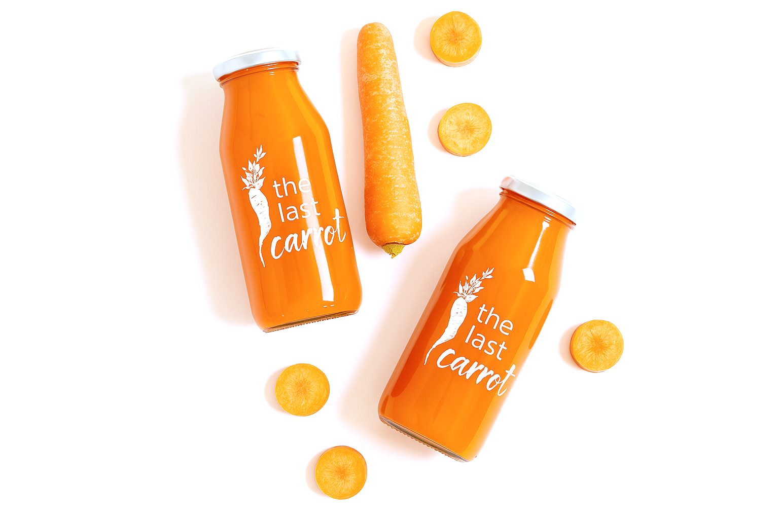
“The new look gives us confidence. It finally matches the quality of what we serve every day.”

-Location Owner

Branding & Marketing

I created a brand system that wove The Last Carrot’s personality, heritage, and values into every detail—bringing the same warmth you feel when you walk up to the storefront into the menus, packaging, and signage. Every touchpoint was designed to feel fresh, familiar, and unmistakably theirs.

Color

The Last Carrot’s color palette is rooted in nature, designed to reflect the warmth, freshness, and organic quality of its menu.


Drawn from produce itself, earthy oranges, leafy greens, and golden yellows, the colors feel vibrant yet natural. They create an inviting atmosphere that mirrors the experience of walking into the shop or unwrapping a freshly made sandwich.


Rather than feeling trendy or over-designed, the palette is timeless, ensuring the brand stays relevant as the neighborhood evolves while staying true to its roots.

Primary Palette

Off-Black

Hex: #212121

Red Orange

Hex: #C04E0F

Yellow

Hex: #EAB411

Grey

Hex: #6F6F6F

Light-Grey

Hex: #F1F1F1

White

Hex: #FFFFFF

Typography

I chose a combination of Atmosphere Script and Raleway to create a distinct voice for The Last Carrot. One that feels fresh, local, and timeless while guiding the eye through each piece of communication with clarity.

Headings

Atmosphere

A textured, brush-style script that captures the natural, artisanal quality of The Last Carrot’s food. Its hand-painted feel adds authenticity and character, making the logo instantly recognizable and rooted in the brand’s fresh, made-by-hand ethos.

Primary Typeface

Raleway Medium

Used for most body text and key labels, Raleway Medium is clear, versatile, and highly readable in both digital and print formats. It creates a cohesive visual rhythm when paired with the logo.

Secondary Typeface

Raleway Bold

Applied sparingly to highlight important information, such as menu prices or callouts. Raleway Bold draws attention without overpowering the design, ensuring emphasis where it matters most.